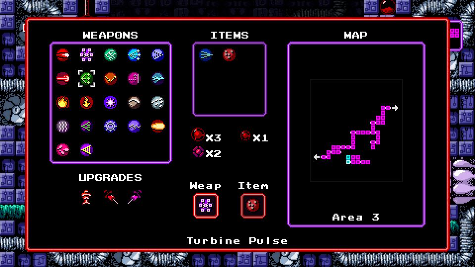
Inventory
/
This past week I've been working on the inventory screen. I'm at the point where the number of unique items has made it cumbersome to give each one its own controller mapping, so I've switched the mapping to a Zelda-like interface with a single button for attack and another button for item.
To keep the action flowing, I've updated the quick-select interface to allow selecting a weapon or item by pressing a shoulder button during play, Mass Effect style. The action pauses as long as the button is held to keep you from getting killed as you browse your arsenal.

If you managed to find the (ancient, moldy, outdated) demo that's floating around, you'll see that this is different in that it features two rows, as well as pausing the gameplay as you scroll.

Graphically, AV is somewhere between NES and SNES, so I took most of my inspiration from games of those eras - probably A Link to the Past more than anything else. But it's always tricky to try to balance these things. I may yet add button icons pertaining to the relevant platform, or a means to select a separate "chat" interface similar to Phantasy Star IV or Metal Gear Solid. What do you think?